Transforming Awkward Spaces: Creating a Stunning Stairway Gallery Wall
Every homeowner occasionally faces those challenging architectural quirks that seem to defy conventional decorating. For many, a common culprit is the half wall, especially when it’s situated in a high-traffic area like a foyer or leading up a staircase. These walls can feel incomplete, visually confusing, and often leave us scratching our heads about how to integrate them seamlessly into our home’s aesthetic. Instead of viewing these features as limitations, what if we saw them as blank canvases awaiting a creative transformation? This is precisely the journey we embarked upon, turning a particularly perplexing half wall in our foyer into a dynamic and inviting stairway gallery wall that adds character and charm.
The Foyer Dilemma: Tackling the Awkward Half Wall
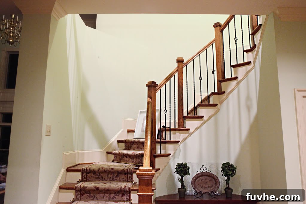
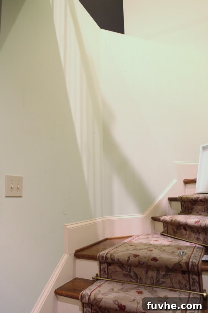
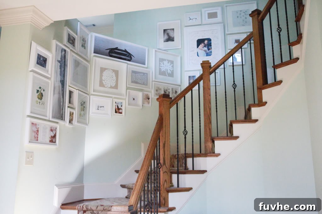
Our foyer presented a unique design puzzle, one that many homeowners might find relatable. It wasn’t just a straightforward half wall leading up the stairs; it was a half wall that then inexplicably curved, morphing into a full wall. This unconventional transition created a visual disruption, making the entire space feel disjointed and, frankly, a bit “half-baked.” It lacked warmth, personality, and a sense of purpose, driving us in circles both literally and figuratively as we tried to envision a solution. The goal was clear: we needed a way to bridge this architectural divide, making the “halfer” and the “fuller” walls coexist harmoniously and aesthetically pleasingly. This challenge became an opportunity to redefine the space.
Inspiration Strikes: A Timeless Decor Solution for Staircase Walls
Inspiration often comes from unexpected places, or in our case, from familiar sources reimagined. We recalled an elegant display from an old Pottery Barn catalog where a designer had artfully arranged frames in a stair-stepping pattern alongside a staircase. This concept resonated deeply, not just for its aesthetic appeal but also because it mirrored a cherished memory: my mom had a similar, beloved arrangement gracing her stairway for many years during my childhood. It was a timeless technique for adding character and warmth to often-overlooked spaces. This classic approach seemed like the perfect antidote to our foyer’s half-wall woes, offering a visual narrative that would naturally ascend with the stairs, uniting the disparate wall sections and transforming a blank space into a focal point.
Gathering Your Gallery Arsenal: Frames and Foundations for Your DIY Project
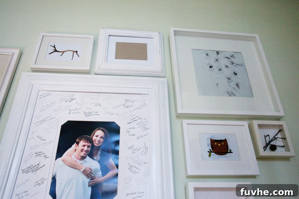
With a clear vision in mind, the next step was to gather the necessary materials. Fortunately, I had a secret weapon: a substantial stash of picture frames. A significant majority, probably 90%, were crisp white frames, many sourced from Ikea – a testament to their versatility, affordability, and ability to create a clean, modern aesthetic. White frames are an excellent choice for a gallery wall, as they provide a cohesive backdrop that allows the artwork or photographs within to truly shine, regardless of their content or color palette. Having a readily available collection meant we could jump straight into the creative process without the delay of extensive shopping. For those starting from scratch, consider a mix of sizes and styles, but sticking to a dominant frame color can help achieve a unified, polished look effortlessly.
The Organic Approach: Designing Your Gallery Wall Without a Blueprint
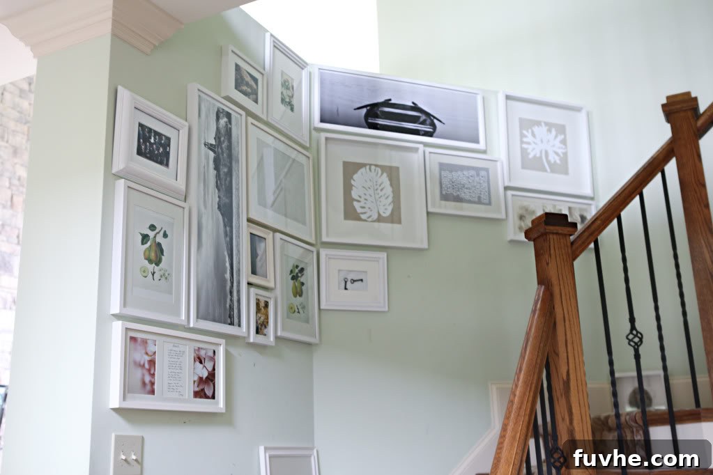
While many seasoned DIYers advocate for meticulous planning – cutting out newspaper templates or using wrapping paper to map out a gallery wall (a technique famously championed by my girl Sherry from Young House Love) – we opted for a more spontaneous, organic approach. Sometimes, the best designs emerge from intuition and direct interaction with the space, especially when dealing with unusual architectural features. There was no pre-conceived plan, no tape measures beyond ensuring general spacing, and certainly no paper cut-outs. Our method was simple: we started by hanging the largest frames first, strategically placing them to establish the main anchor points of the display and define the general flow. Once these foundational pieces were in place, we began to fill in the surrounding areas with smaller frames, allowing the arrangement to evolve naturally, frame by frame. This iterative process allowed us to adapt to the unique contours of the wall and the staircase, ensuring a perfect fit and visual harmony.
Key to Cohesion: Bridging the Divide Between Half and Full Walls
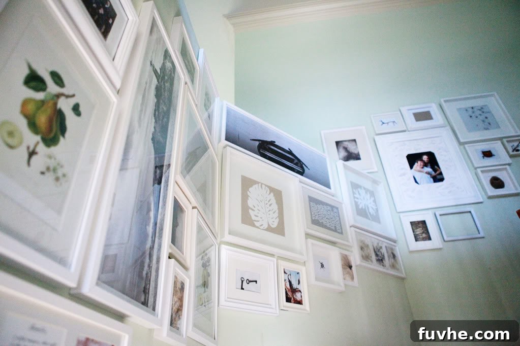
As the gallery wall began to take shape, a crucial design element emerged that truly tied the entire composition together and solved the initial architectural dilemma. The challenge was to visually merge the half wall with the full wall it curved into, creating a seamless transition. The solution was found in a single, strategically placed frame. This particular frame extended from the visual plane of the full wall, positioned just above where the half wall ended, essentially “overlapping” the perceived boundary. This seemingly small detail had a profound impact. It created a seamless visual transition, effectively “stitching” the two wall sections together and making the entire arrangement feel like one cohesive unit, rather than two separate displays. This single frame served as an anchor, guiding the eye smoothly from one architectural feature to the next and transforming the initial awkwardness into a deliberate, sophisticated design choice.
The Next Step: Curating the Content Within Your Frames
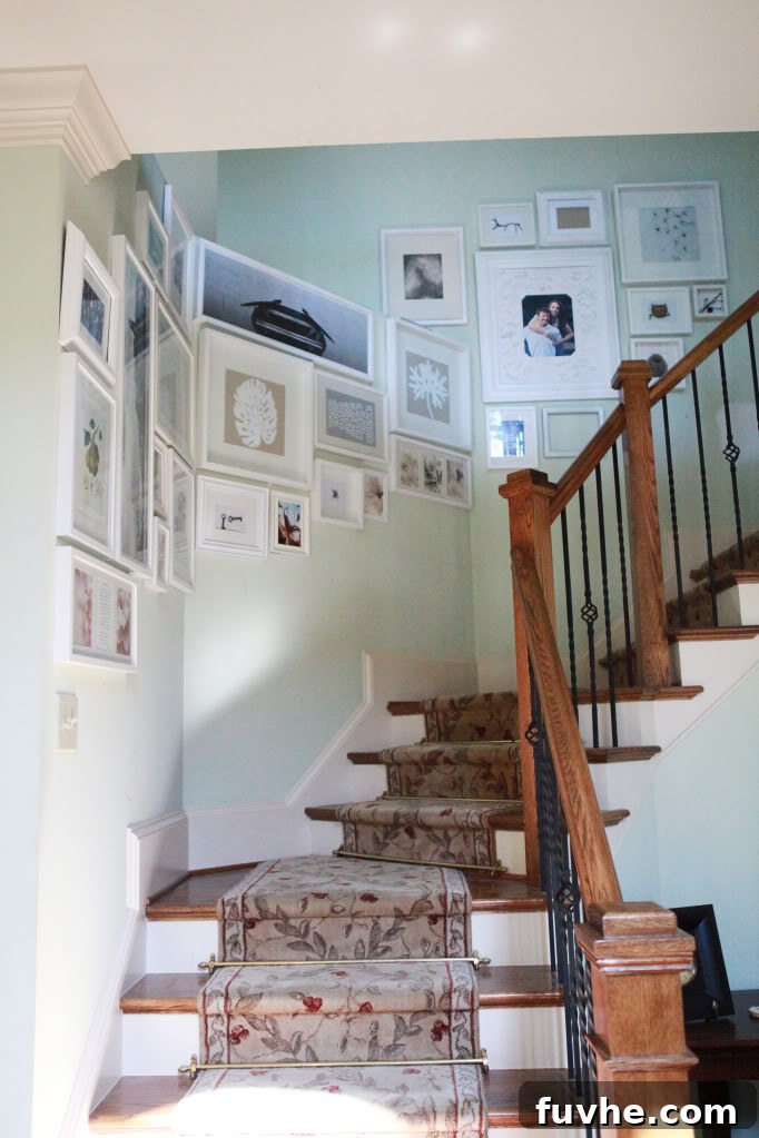
With the physical structure of the gallery wall complete, the final, and arguably most exciting, phase awaits: filling the frames. Currently, our frames hold a delightful, albeit random, assortment of artwork from their previous homes. This eclectic mix, while charming, is merely a placeholder. The true magic of a personalized gallery wall lies in its content. This stage offers an incredible opportunity to infuse the space with personality, memories, and artistic flair. Consider curating a collection of cherished family photographs, vibrant travel prints, inspirational quotes, children’s artwork, or even a mix of abstract pieces and mirrors to add depth and reflection. The possibilities are endless, allowing you to tell a unique story and create a visual journey for anyone ascending your staircase. The key is to select pieces that resonate with you and complement your home’s overall decor and color scheme, creating a truly unique and meaningful display.
Beyond the Build: The Transformative Impact on Foyer Design
The transformation has been remarkable. What once felt like a frustrating, incomplete architectural feature has now become a captivating focal point in our foyer. The half wall, far from being an eyesore, now feels intentional and integrated, elevated by the artful display of frames. It’s akin to discovering an unexpected joy – the formerly awkward space now holds a newfound charm and appeal, significantly enhancing the entrance to our home. It demonstrates how a creative approach to home decor can completely alter the perception of a challenging area, turning a design problem into a cherished feature that adds character and depth to the entire home. The visual confusion has been replaced by an inviting path of memories and aesthetics, proving that even the trickiest spaces can be beautifully conquered.
Tips for Creating Your Own Stunning Stairway Gallery Wall
Inspired to create your own staircase gallery? Here are some actionable tips to help you design a beautiful and cohesive display that will impress guests and delight residents:
1. Start with a Vision (but Allow for Flexibility)
Before you even pick up a hammer, envision the overall feel you want for your gallery. Do you want it to be monochromatic, colorful, sentimental, or abstract? Gather inspiration from magazines, Pinterest, or other home decor blogs, paying attention to layouts that appeal to you. However, be prepared to deviate slightly from your initial plan; sometimes the best arrangements happen organically, especially when working with unique wall shapes.
2. Gather Your Materials Wisely
Collect a variety of frame sizes, but consider maintaining a consistent color or material for frames (e.g., all white, all natural wood, or a sophisticated mix of black and gold) to ensure a cohesive look. Scour thrift stores, flea markets, and discount retailers like Ikea for affordable options that won’t break the bank. Don’t forget your hanging hardware, including picture hooks, nails, and a level!
3. Plan or Play? Choose Your Method
For those who prefer precision, the paper template method (cutting out paper shapes the size of your frames and taping them to the wall) is invaluable. It allows you to experiment with layouts before making any permanent holes. If you’re more adventurous, like us, start with your largest frames as anchors and intuitively fill in the gaps with smaller pieces. Both methods can lead to stunning results, so choose the one that aligns with your comfort level.
4. Anchor Your Design with Key Pieces
Whether you’re planning or playing, begin by placing your largest or most significant frames first. These will serve as the anchors around which the rest of your gallery will revolve. Ensure they are well-spaced and establish the general upward flow you desire for a stairway display, maintaining a consistent distance from the stair railing or ceiling line.
5. The Power of Connection: Bridging Architectural Gaps
If you have an awkward architectural feature like a half wall, a curved wall, or a transition between two different wall types, think about how certain frames can visually connect these areas. As we discovered, a strategically placed frame that extends across a divide or bridges a corner can work wonders in creating a unified and fluid look, turning a perceived flaw into a design highlight.
6. Curate Your Content Thoughtfully
What you put inside the frames is just as important as the frames themselves. Mix personal photos with art prints, abstract pieces, mirrors, or even textile art for added texture. Consider a theme – family milestones, travel memories, a particular color palette, or inspirational quotes. Don’t be afraid to leave some frames empty for a minimalist touch or to easily rotate new art seasonally.
7. Step Back and Adjust
Periodically step away from your wall to view the arrangement from different angles and distances – from the bottom of the stairs, the top, and even from across the room. This helps you spot imbalances or areas that need adjustment. A gallery wall is a living display; it’s okay to make tweaks until it feels just right and harmonizes with the surrounding decor.
Conclusion: Turn Your Architectural Challenges into Design Triumphs
Our journey from a confusing half wall to a captivating stairway gallery wall is a testament to the power of creative problem-solving in home decor. What started as an architectural headache has evolved into a beloved, personalized feature that enhances the entire foyer, making a strong style statement. Don’t let awkward spaces intimidate you. Instead, embrace them as opportunities to infuse your home with unique character and personal style. With a little inspiration, some readily available materials, and a willingness to experiment, you too can transform any challenging nook or cranny into a design triumph, creating a space that is both functional and beautifully reflective of you. Elevate your home, one frame at a time!